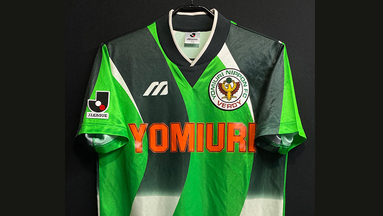
When talking about football shirts from the early days of the J.League, Verdy Kawasaki is a club that cannot be overlooked.
One of the J.League’s strongest clubs from its launch in 1993, Verdy Kawasaki also captivated fans with its distinctive shirt designs.
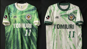
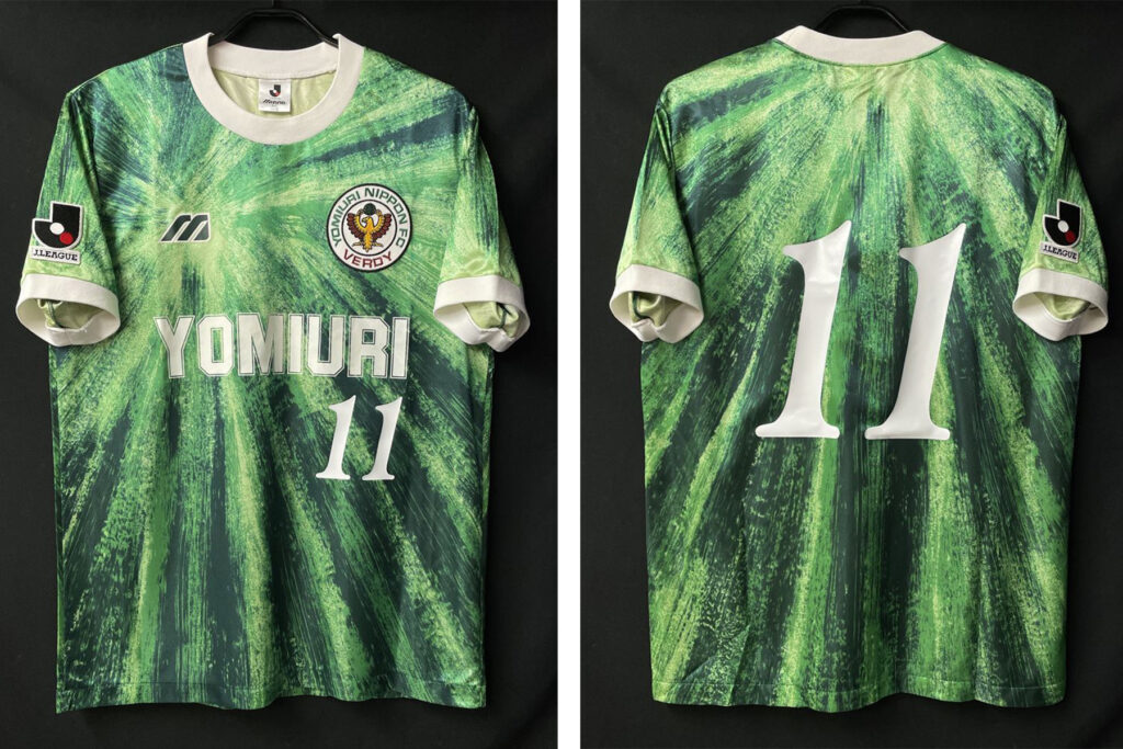
The most famous of these is undoubtedly the shirt worn in 1993/94, commonly known as the “Watermelon” shirt. Its vivid green color and distinctive graphics captured the colorful spirit of the early J.League and remain highly popular today.
But Verdy Kawasaki has another classic that deserves attention.
That is the club’s second shirt design, introduced in 1995.
Travis Scott Wore It at the NBA Finals
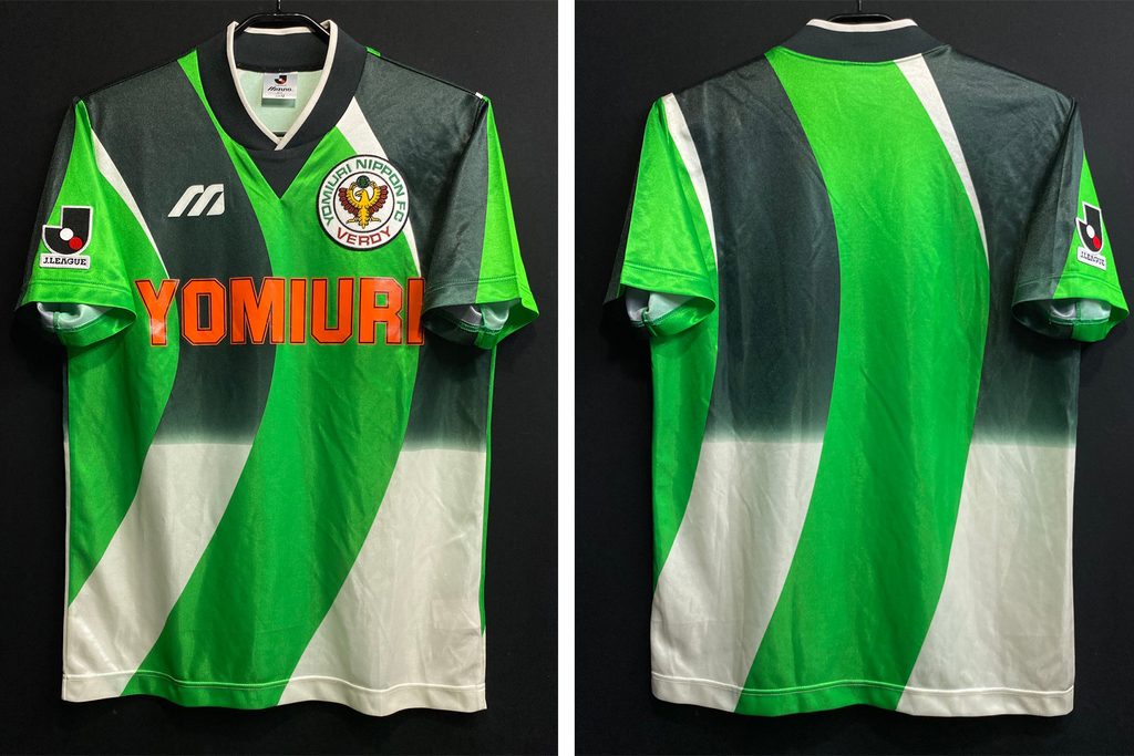
In 2024, world-famous rapper Travis Scott was spotted wearing this 1995/96 Verdy Kawasaki shirt at the NBA Finals, attracting considerable attention.
The fact that an internationally known artist, rather than someone from the Japanese football scene, wore a vintage J.League shirt as a fashion piece brought this shirt attention from overseas as well.
While the exact reason he chose the shirt is not known, its vivid green color and bold graphics have an appeal that fits naturally with today’s vintage fashion.
So, who was behind this striking design?
Verdy Kawasaki’s “Second” Shirt
In 1995, Verdy Kawasaki moved away from the look of its famous “Watermelon” shirt and introduced a bold new design centered around a vivid shade of green.
The shirt was designed by Junko Koshino, one of Japan’s most renowned fashion designers.
Having a fashion designer take on the full design of a football shirt was a particularly unique concept at the time.
“I Want a Shirt That Makes Us Look Strong”
The design was closely connected to Ruy Ramos, one of Verdy Kawasaki’s biggest stars.
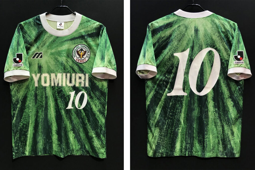
No. 10 – Worn primarily by Ruy Ramos
Ramos is said to have told Junko Koshino that he wanted “a shirt that makes us look strong.”
The two had already known each other for some time. Ramos bought clothes designed by Koshino and even invited her to watch Verdy’s matches.
There was also an interesting story surrounding their relationship. Whenever Koshino came to watch, Verdy somehow seemed to avoid defeat. Before long, she came to be regarded as something of a “lucky charm” for the team.
Emphasizing “Verdy = Green”
One of the key elements of the design was the club’s signature color: green.
At the time, Verdy’s green was relatively close to the color of the grass, and there were concerns that the players could become difficult to see on the pitch.
The solution was an extremely vivid shade of green, reminiscent of the bright colors used for emergency lights.
It made the players stand out on the pitch while reinforcing the club’s identity of “Verdy = Green.”
The color scheme also matched Ramos’s desire for a shirt that would make the team look strong.
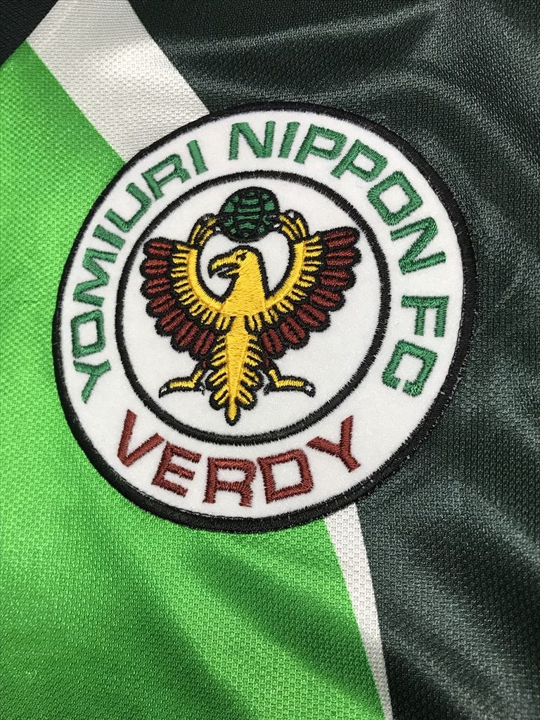
A Bold Graphic Stretching from the Chest to the Shoulders
Another defining feature is the large, bow-like graphic extending from the chest toward the shoulders.
Several colors were combined with the green base to create a fashion-forward look that stood apart from conventional football shirts.
The design combines the boldness of the 1990s with the refined touch you would expect from a fashion designer.
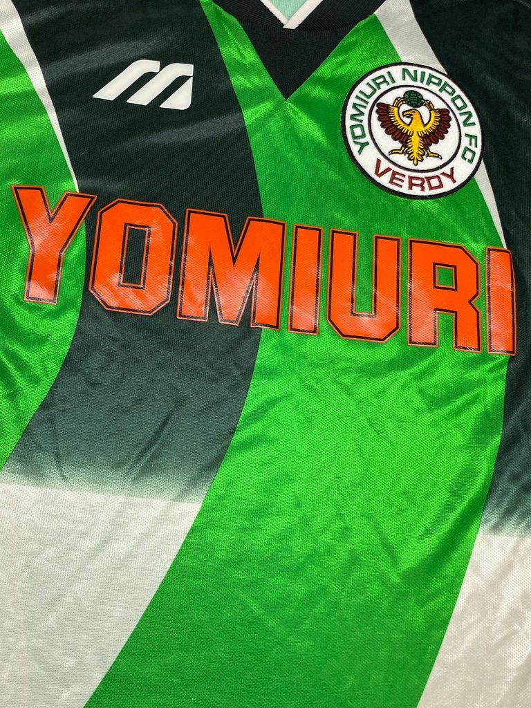
Different Sponsors on the Player Issue and Retail Version
One particularly interesting detail for collectors is that the Player Issue and Retail Version featured different chest sponsors.
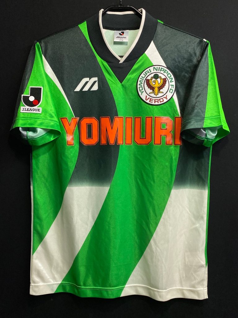
1995/96 Verdy Kawasaki(Home)
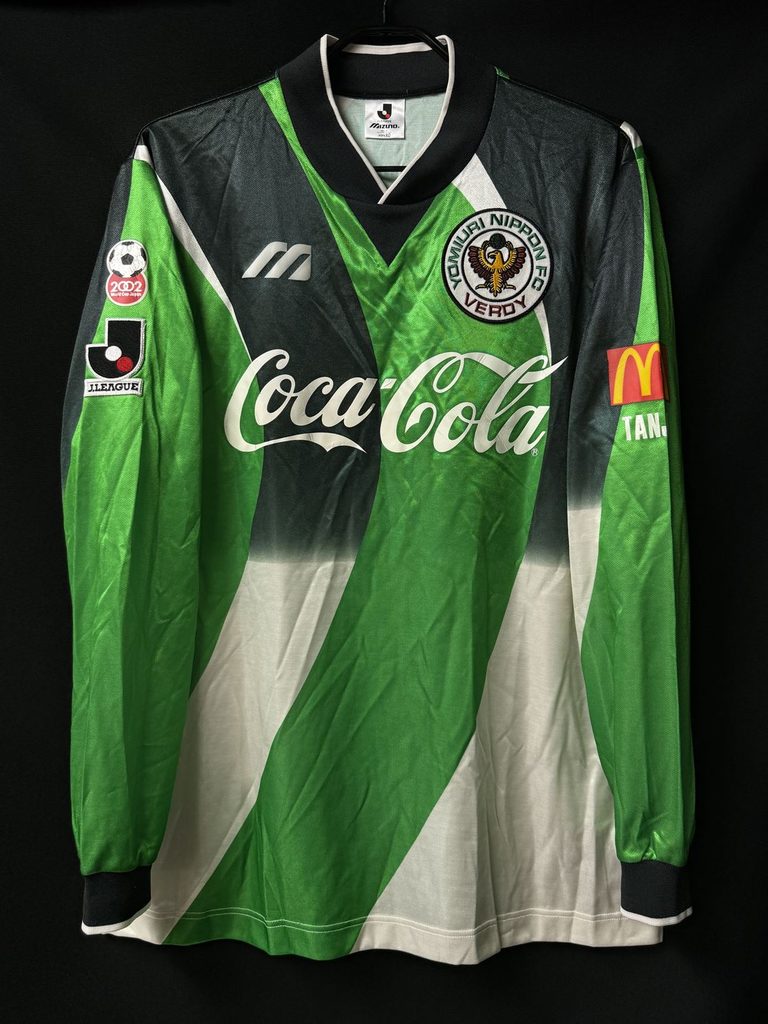
1995 Verdy Kawasaki(Home)
The commercially available Retail Version featured “YOMIURI” on the chest.
Meanwhile, the Player Issue worn by the players had different sponsors depending on the season.
In 1995, the chest sponsor was “Coca-Cola,” while in 1996 it was “MALT’S.”
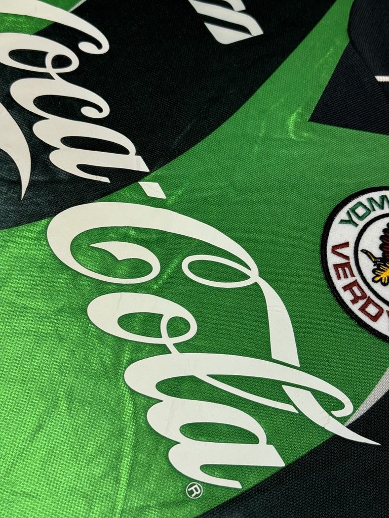
The fact that the same design could look noticeably different depending on the sponsor is one of the fascinating details of J.League shirts from the 1990s.
Junko Koshino Designed More Than Just the Shirt
Junko Koshino’s work for Verdy Kawasaki went beyond the football shirt.
She also designed the team bus used by the players, giving it an equally eye-catching appearance. It is said that fans would even gather when they spotted the bus driving through the city.
Bringing the shirt and team bus together under the same design concept was a distinctly fashion-driven approach to branding the club as a whole.
More Than Just the “Watermelon” Shirt
When people think of Verdy Kawasaki, the 1993/94 “Watermelon” shirt is probably the first one that comes to mind.
But the 1995/96 model is another fascinating example of the creative freedom that defined the early J.League.
A bold design by Junko Koshino, an intriguing connection with Ruy Ramos, and a surprising rediscovery in today’s international vintage scene.
This shirt stands at the intersection of 1990s Japanese football, fashion, and today’s vintage culture.